WUSA Homepage Redesign
Waterloo Undergraduate Student Association (WUSA) underwent a re-branding from Feds to WUSA. Time to update the homepage!
Project Overview
What is in scope for the WUSA homepage redesign?

WUSA Homepage Project Overview
Feds has been rebranded and now known as WUSA. With the new fancy name, also came a complete overhaul of the brand. We will redesign the homepage of the WUSA website to align with these recent brand changes.
- Redesign the homepage to match updated WUSA branding
- Enhance the hero to be more flexible maintaining ease of maintenance and upkeep
- Reduce the need to create new features on a weekly basis
- Expose key subpages for easier and more direct navigation
- Design researcher
- UI designer
- UX design and strategist
- Front-end developer
- Adobe XD
- Drupal 7 Framework
- HTML & CSS
Understanding the Current Landscape
Uncovering pain points from website users and maintainers.

Design Research
To gather an in-depth understanding of the current site, I interviewed two key user groups, students, who consume the content, and staff, who maintain the content. The focus of these interviews was to uncover the priority of content types, what gets used often, what does not get used frequently, and pain points when updating content.
Key Results:
Key Results:
- The hero always looks the same. Could have more of an impact
- The feature section is difficult to maintain. Sometimes we don’t have content to post making it appear dated
- Images to match the feature in the correct size ratios have proven to be more difficult than expected
- News and updates are positioned low. Would be nice if was closer to the top
Generating Creative Concepts
Generating and evolving concepts into potential solutions .

Ideation
Sketching was my way of starting to put some structure to some thoughts and ideas. I was able to roughly outline basic guidelines for structural and potential visual solutions.
Findings:
Findings:
- Removing the large features section all together will allow the other sections below to move up on the page organically.
- The most current three news articles rotate chronologically and would be better positioned closer to the top of the homepage. Since the content is refreshed organically, this will help to keep content fresh and up to date.
- Working with options to reduce the number of rotating photography as high-quality images can be difficult to obtain.
I created low fidelity wireframes for stakeholders using Adobe XD to visualize concepts.
Findings:
Findings:
- Update the hero section structure for easy yet flexible implementation of visuals including but not limited to photos.
- Removal of features section
- Move News & Updates directly under the hero section
- Add WUSA services to the homepage as the analytics indicate heavy usage in this area
- Add a section for clubs as analytics show clubs are a top driver of user engagement on the website
- Mimic the top navigation structure to re-enforce our information architecture
Sample results provided by TreeJack test analysis.
Expand Ideas to Visual Concepts
Evolve concepts with brand to create visually pleasing and engaging high-fidelity solutions.
Prototyping
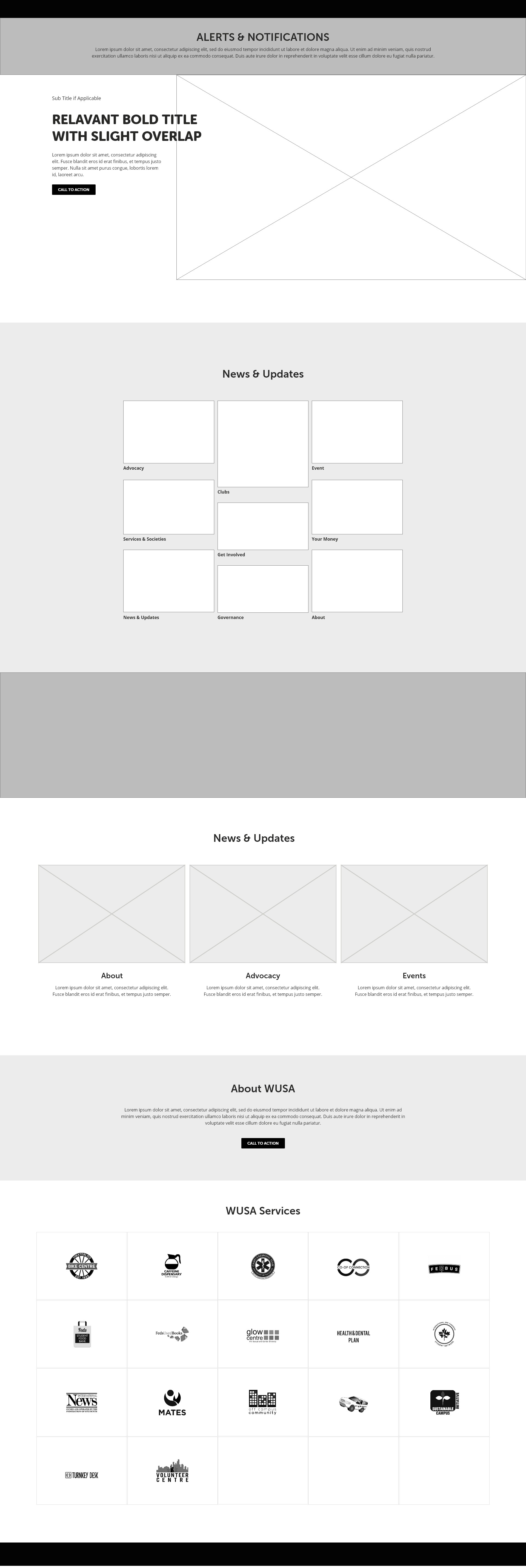
Implementation of the wireframe feedback, I created a high-fidelity prototype. Key features included in the UI concept include:
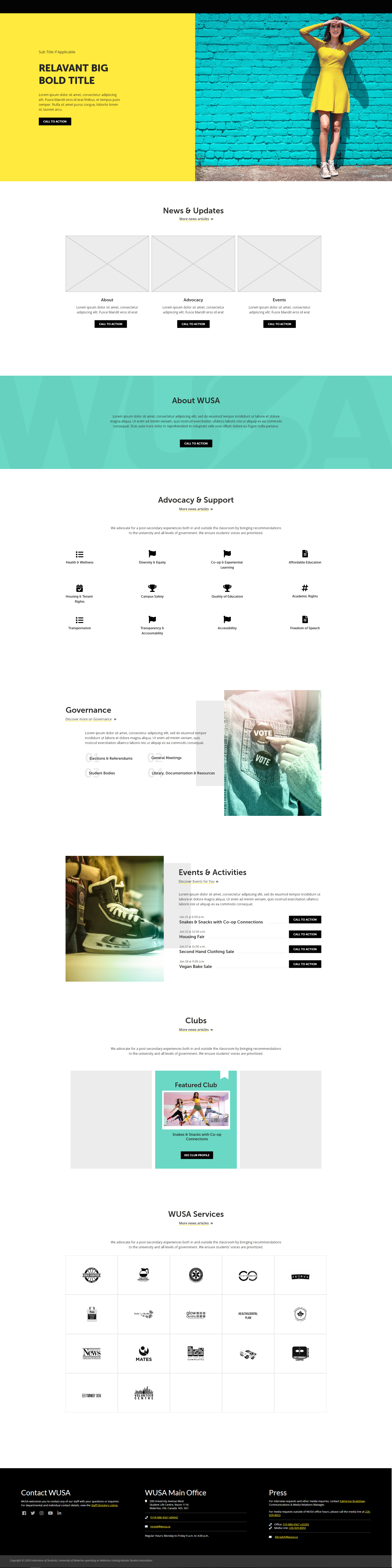
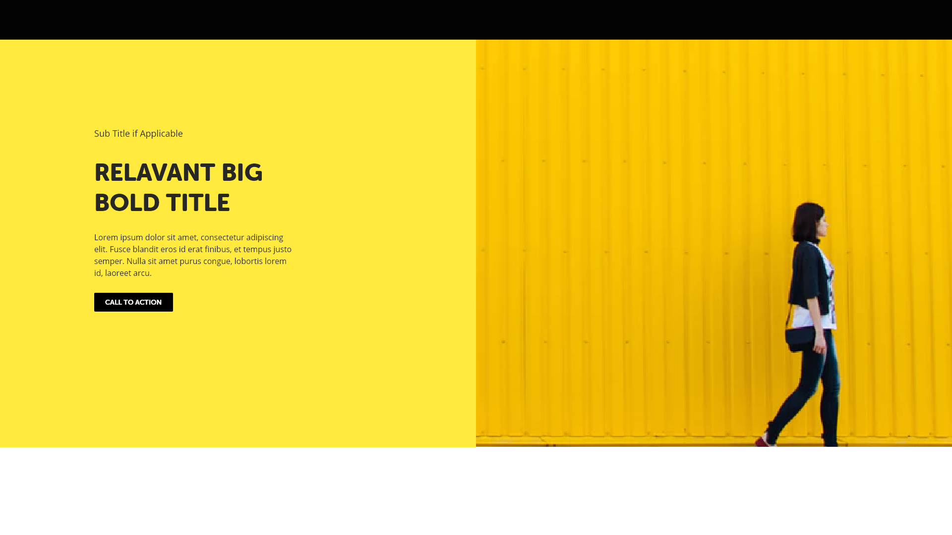
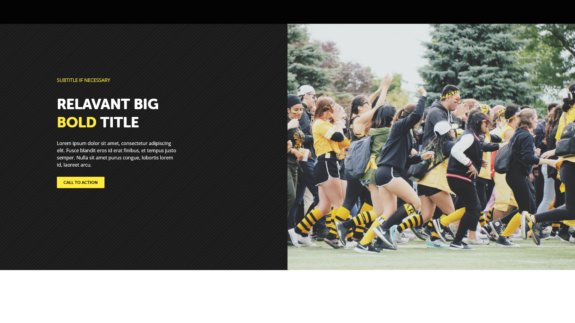
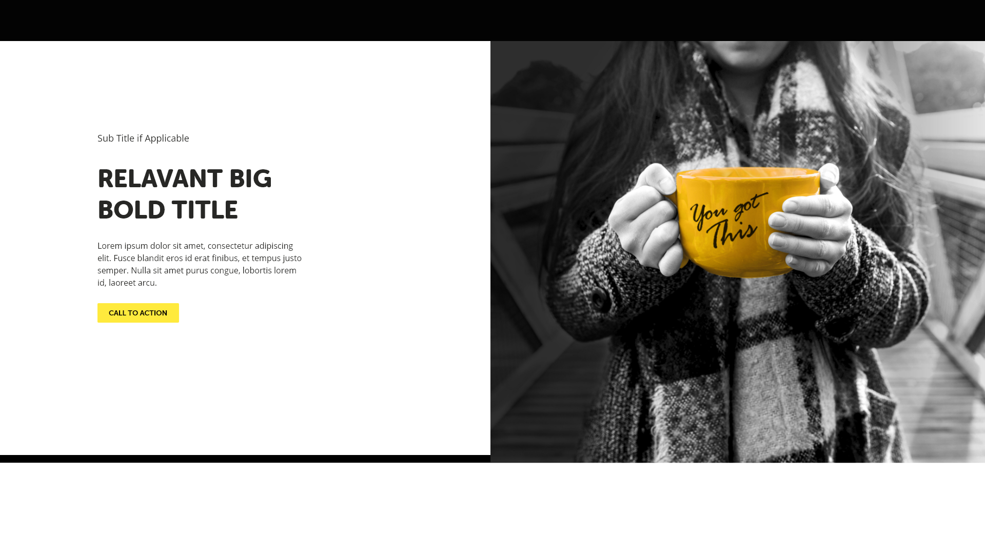
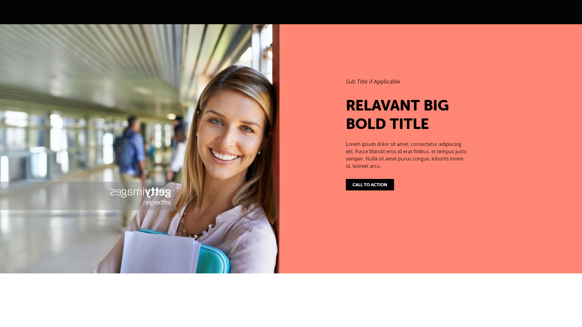
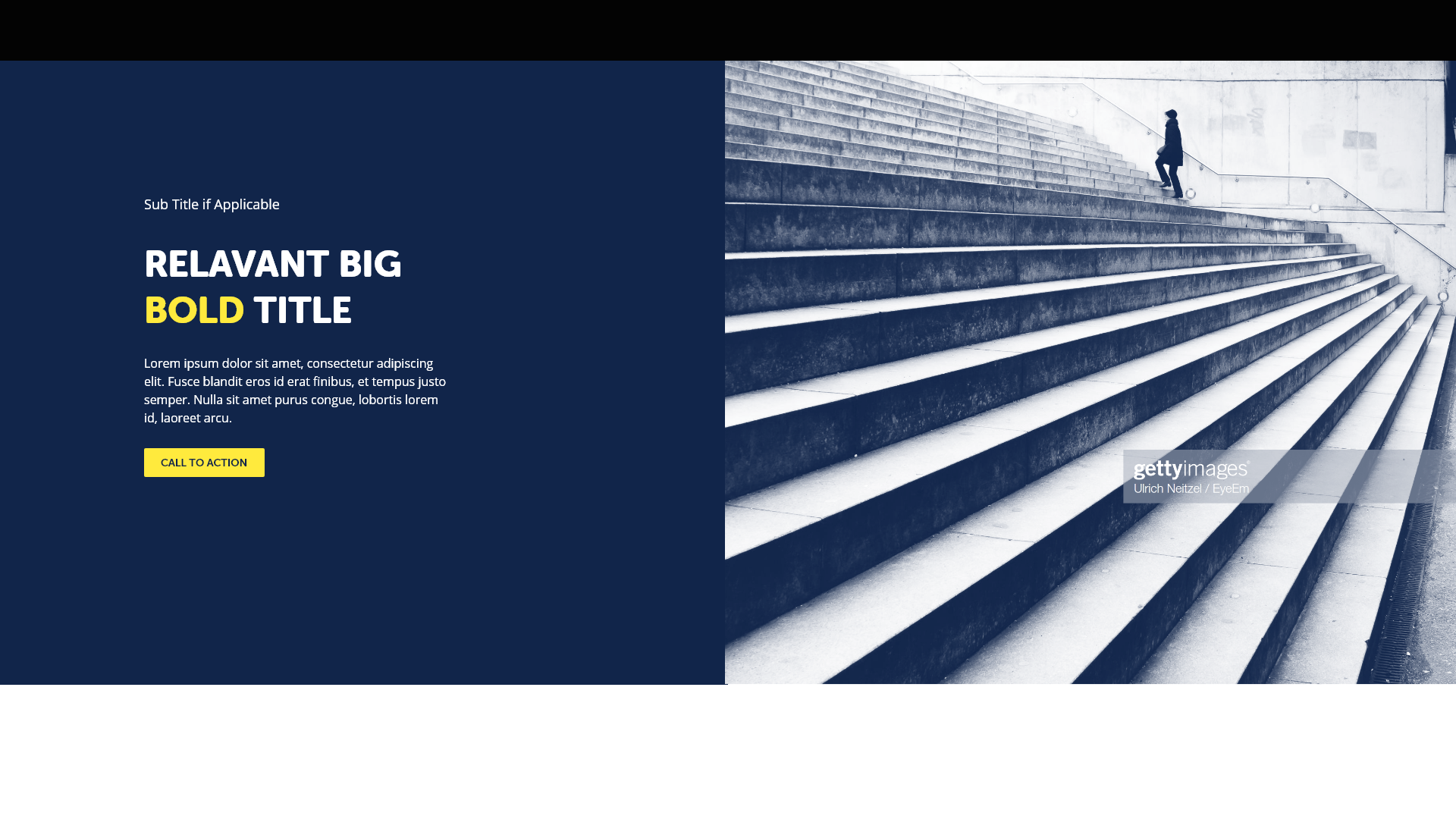
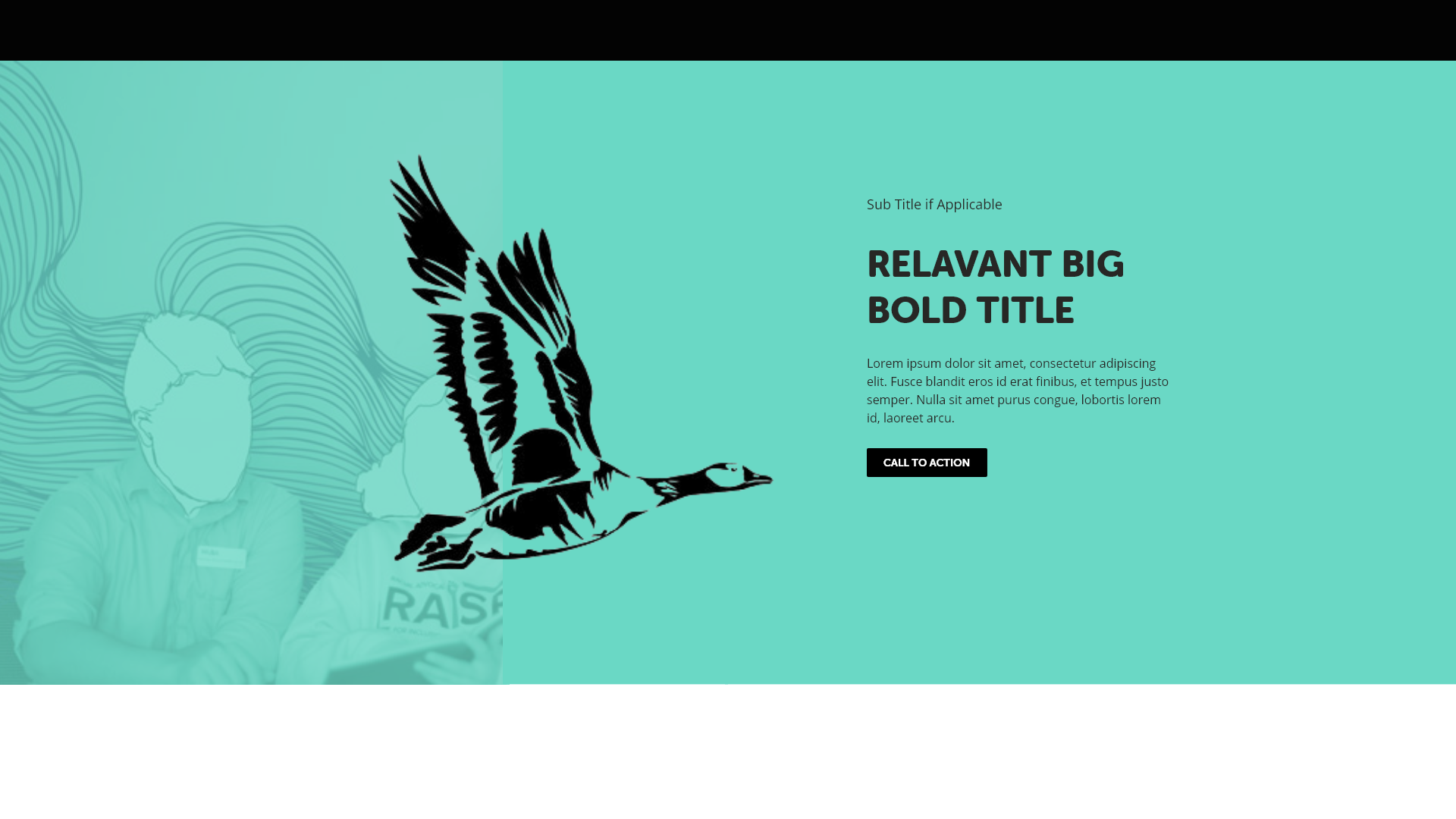
- Split screen hero which allows flexibility in background colours, text colour to ensure colour contrast meets WCAG standards, and text and photo location,
- News & Updates section is much higher on the page
- Added new sections including Advocacy & Support, Governance, and Services which also reaffirms the major sections of the website navigation
- Applied the new colour and brand revising the overall look and feel